By definition, a landing page is a web page which serves as the entry point for a website or a particular section of a website. Rather than directing visitors to a general website's architecture (be it for ad or product details), a specially-designed page with limited links can work magic.
Trends show modern companies using the mix of
- click-through pages
as well as - transactional landing pages.
Click-through landing pages are designed to show information relevant to the visitor. This is helpful for users looking to learn more. Eg: display text, images, video dynamic compilations of relevant links. Transactional landing pages are pages crafted to influence a visitor to take action by accomplished an interaction on the web page. It could be filling out a form with their personal details or contact information in exchange for a tempting offer which could be delivered by the marketing experts. This makes way for lead generation making life easy by giving permission to continue talking/marketing to them.
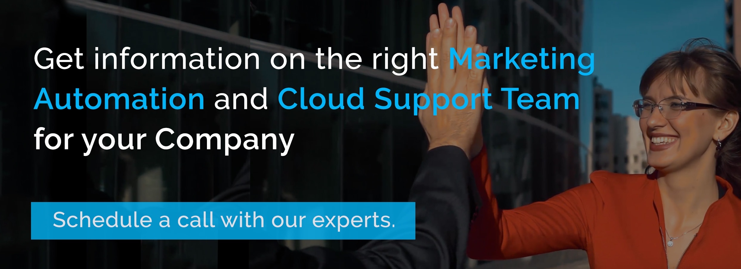
What separates a well-designed landing page from good ones? Is it attractive design by a genius designer or a strongly crafted content by a marketing/content specialist, which creates value to the the user? These all are considered to be contributing factors to build a good design, but the true distinction lies in how they make visitors/users feel.
For instance, if you try to show bullet points of the product features, it might not be interesting to the visitors. But if you try to rewrite those headlines showing the benefits they get for taking action (eg: subscribing, sign up), the user converts from a visitor to a lead customer to the business. Every experience has an emotional component and when it comes to products as well, it is no different.Therefore, incorporating emotion should be the key consideration while designing websites and landing pages.The ultimate goal is to convert the visitor into a customer.
For a user-driven web page optimization:
- Apply multimedia Technology in an optimized way in order to adapt on all possible user Clients (e.g., Laptop, Smartphone, tablet) and browser technology.
- Build trust and showcase user benefits by understanding human psychology and behavior.
- Achieve goals by optimizing the interaction between technology and humans.
Some of the trends made out in global players' 2017 landing pages are listed below.
Trend #1 : Long scrolling landing pages
A/B tests prove that show both long and short landing pages win conversions differently. Companies see more than 35% increase in conversions when the page is longer. This is achieved by giving the visitor a good first impression, complimented by a simple and minimalist layout. Drafting a value based action-packed headline will help the visitor to attract the visitor take a glance above the fold and then scroll down. Arrow shaped prompters or auto anchors can guide users to smoothly slide down the page for deep diving or lead capturing. To know whether it’s the Long or Short Landing page which is doing better, A/B testing will give the verdict. However, the analyzed pages show a clear priorization of longer landing pages with a design focused on keeping the visitors happy.
Trend #2: Minimalist design
From coding to visual elements, everything counts. The mantra is “Design follow function”. A logo on the top left side of the page shows an element of trust in the brand. Embrace white space with clear direct headlines and CTAs. The main menu is usually hidden for landing pages. Modern design uses a ‘micro navigation menu’ with the most relevant links, keeping it easy for users to deep dive for information. The user feels happy knowing more about the offer just before making a crucial decision. Design dialogue
Trend 3: Scrolling Trumps Navigation Around The Page
Scrolling has now become a habit among internet users, they do dive deep to get more information. We use similar layout (navigation-approach, icon- and image-language, structuring, etc.), with essential quality content mixed with CTAs’ in multiple pages. This helps in telling a compelling story, overcoming distractions and aim for conversion within least number of clicks/ deviations within a few sets of pages. This consistent design across the websitecomes handy when there is not much space for all information to be shown above the fold of the landing page. To enhance their experience, design thinking approach will keep the visitor engaged, get the relevant data they look for and fulfill the goal. The be on the safe side, we can give pointer or arrow


Trend 4 : Micro Menu in landing pages :
The path to a destination is not always a straight one. To keep things simple, a micro menu with most essential links or navigation anchors. They are included to make the user feel comfortable to search information with-in the page before clicking on to the CTA. We see new websites keeping most essential content on a single landing page, global players now use few supporting links, clickable images and anchors to make it convincing for the user. Thus, all web visitors can be taken for a well-planned journey leading to a conversion.
Trend 5: The consistency factor
We discussed the micro menu in landing pages. The best practices followed by tech giants include keeping consistent formats of CTA’s and links to fulfill the goal of the visitor at the top and bottom of these pages. Design principles suggest keeping familiar icons, sticking to similar branding colors, following menu hierarchy and call-to-actions. Standardizing gives a better chance for the user to familiarize with the web page and take action.
Google Ad words example: When we browse through a micro menu on benefits and Get started, the CTA Start now button looks consistent.


Trend 6: Human-responsive approach
Looking at the different type of people coming, website codes are smart enough to understand the cookies and display variations of same landing pages to meet the conversion goals. People of diverse age groups have different expectations, new age websites can show variations of same landing pages based on a user's perceived age. Humans have a distinct response to images and other aesthetics. Rich metadata can be used for conversions, reaching targeted audience by adapting content for different age groups.
Trend 7: Tangible Images / videos with humans experiencing the solutions
We tend to remember 80% of what we see, but only 20% of what we read. Therefore, choosing the right landing page images makes way for a better lead generation. The imagery of product or service being used work wonders. Part videos and photos with cinematographic videos now make the content interesting. The picture or video can help the visitor to visualize the scenario and its social proof that add value. It is perceived that they need to take action by going ahead with a sign-up or opt a free trial.
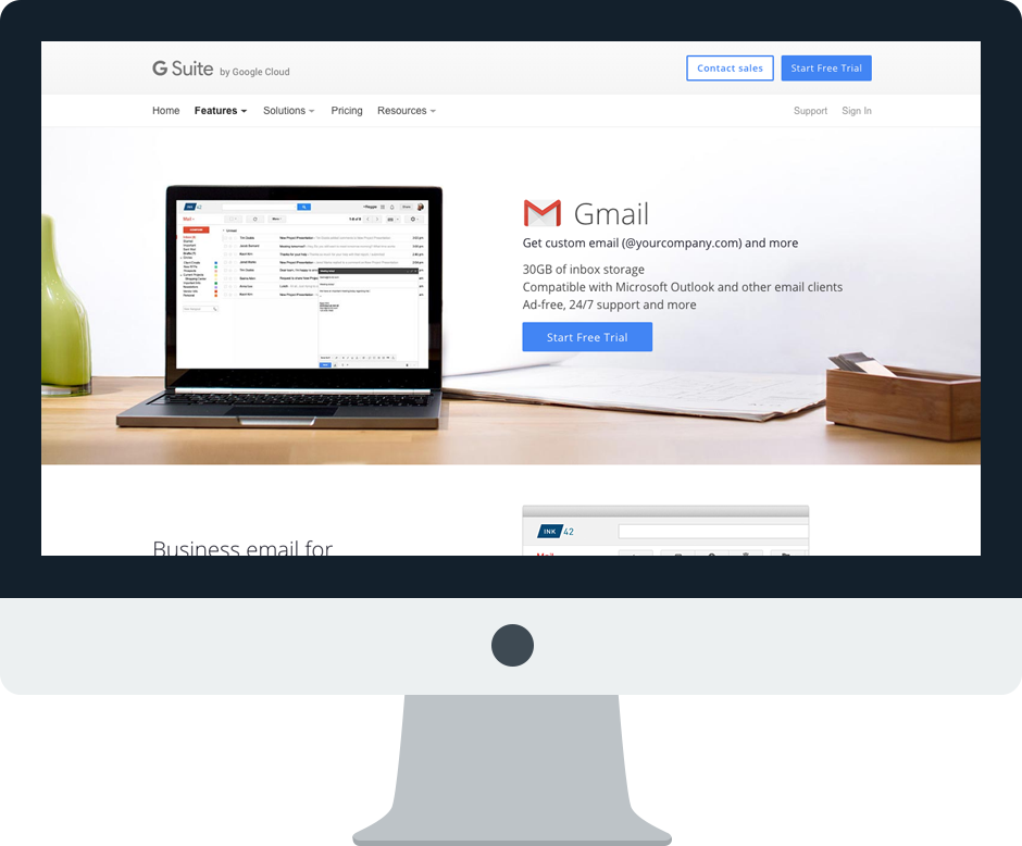
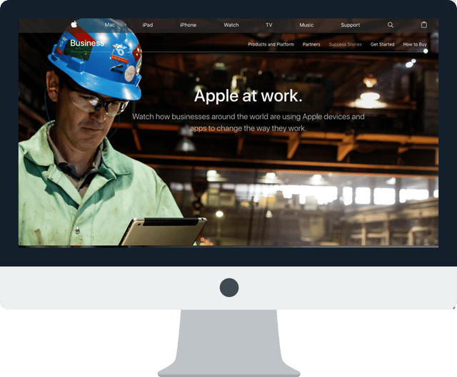
Good Landing Pages Examples
- Google Gmail – https://gsuite.google.co.in/intl/en_in/products/gmail/
- Apple for Business – https://www.apple.com/business/products-platform/